In previous articles, we have learned about the foundations of data science and the basics of data science using Python.
Now, we move on to the next step i.e. Exploratory Data Analysis and visualization in detail. We will learn and implement Python code for data analysis and visualization on a scikit-learn inbuilt dataset.
Data Analysis and visualizations are critical in Data Science and Machine learning projects. Data analysis and visualization helps in getting insights into data that is worthwhile for progress and understanding of data. Data analysis and visualizations help in bringing relevant information from all data.
Data Visualization is to explore data in as many ways as possible until data is analyzed properly and a story is created out of it. There is a beautiful phrase:
“A picture is worth a thousand words”
A picture can tell a story more beautifully than lots of written words. Remember when we were kids, there were lots of pictures in our storybooks. As kids, we don’t read many words but understand the story by only visualizations.
Plotting for Exploratory Data Analysis
In every data set, we have many variables( which are also called features, input variables, or independent variables) and target/output variables (which are also known as labels or dependent variables or class or class labels). We need to understand each feature independently and the relationship between different features. The goal is to get ready the dataset for Machine Learning algorithms implementation.
There are beautiful libraries in Python to explore data visualizations like Matplotlib, Seaborn, Plotly, etc. In this article, we will use Matplotlob and Seaborn.
Dataset Introduction
Let’s take a toy dataset Iris Flower Dataset to understand data visualizations and analyze data in-depth. The data set consists of 50 samples from each of the three species of Iris Flower: Setosa, Virginica, and Versicolor. The species is the target variable and it has 4 features Sepal Length, Sepal Width, Petal Length, Petal width
Import Libraries and Load Data
Let’s first Import all libraries needed.
| Python Code: import pandas as pd |
First of all, let’s load the data set from the sklearn libraries:
| Python Code: from sklearn.datasets import load_iris |
Convert this dataset into a data frame and here are the top 5 rows with 4 features(Sepal Length, Sepal Width, Petal Length, Petal width) and one target variable(Species).
| Python Code: iris_df = pd.DataFrame(data = iris[‘data’], columns = iris[‘feature_names’]) iris_df[‘Species’] = iris[‘target’] #Convert numerical Species value with ‘text’ value iris_df[‘Species’] = iris_df[‘Species’].apply(lambda x: ‘setosa’ if x == 0 else (‘versicolor’ if x == 1 else ‘virginica’)) iris_df.head() |
Output:
| sepal length (cm) | sepal width (cm) | petal length (cm) | petal width (cm) | Species | |
| 0 | 5.1 | 3.5 | 1.4 | 0.2 | setosa |
| 1 | 4.9 | 3 | 1.4 | 0.2 | setosa |
| 2 | 4.7 | 3.2 | 1.3 | 0.2 | setosa |
| 3 | 4.6 | 3.1 | 1.5 | 0.2 | setosa |
| 4 | 5 | 3.6 | 1.4 | 0.2 | setosa |
Let’s see the iris data set size and count among various species.
| Python Code: print(iris_df.shape) #print number of rows and columns print(iris_df[‘Species’].value_counts()) # Counts of every unique Species value Output: > virginica 50 |
Remarks: From the above outputs we can see, that there are a total of 150 data points and data is distributed among 3 species equally. So, we can say this is a balanced dataset.
Bar Plot
A bar plot is a plot that presents categorical data with rectangular bars. The length or height of bars is proportional to the frequency of the category. We can count the values of various categories using bar plots.
Here, we are plotting the frequency of the three species in the Iris Dataset.
Python Code: sns.countplot(x =’Species’,data=iris_df) plt.title(‘Bar Plot for 3 Species’) |
Output:
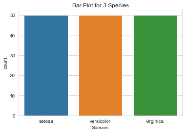
Remarks:
- All bars are of the same height as we know their frequencies are equal.
- Iris Dataset is a balanced dataset.
Pie Chart
A Pie Chart is a circular chart that uses pie slices to show the relative size of data. The arc length of each pie slice is proportional to the quantity it represents.
Here, we are plotting a pie chart for 3 species of Iris flower.
| Python Code: iris_df[‘Species’].value_counts().plot.pie(explode=[0.05,0.05,0.05],autopct=’%1.1f%%’,shadow=True,figsize=(8,8)) |
Output:
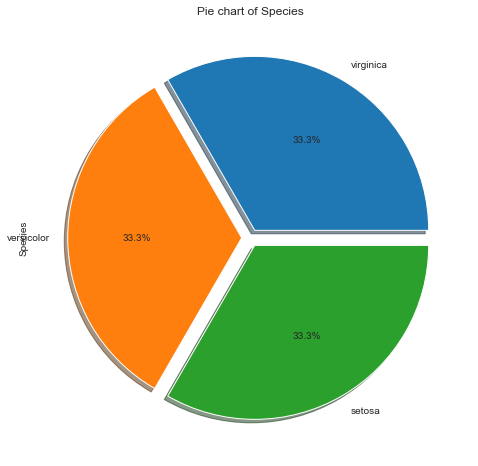
Remarks:
- All three flowers are equal in proportion i.e. 33% each.
- It’s a balanced dataset
Box-plot
Box-plot gives us a five-number summary of any variable: the minimum, maximum, the sample median, the first and third quartile. Box-plot helps in measuring outliers (outliers come outside and far from the box plot)
| Python Code: sns.boxplot(x=’petal length (cm)’, data=iris_df) |
Output:
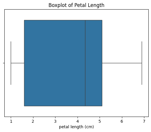
Remarks:
With the above box-plot visualization, we can measure the following parameters:
- The minimum petal length is 1.0 cm.
- The maximum petal length is 6.9 cm.
- The range is Maximum – Minimum = 5.9 cm
- The sample median is 4.3 cm
- The first quartile Q1 is 1.6
- The third quartile Q3 is 5.1
- The IQR(Interquartile range) is Q3-Q1= 3.5
- And the mean value will be between 3.5 to 4
- There is no outlier in this box-plot
We can also draw a box plot for ‘Petal Length’ for all three different species in a single plot.
| Python Code: sns.boxplot(x=’Species’,y=’petal length (cm)’, data=iris_df, hue=’Species’) |
Output:
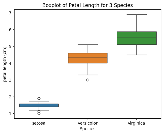
Remarks:
- The Petal Length of setosa is the smallest of all three.
- Virginica has the largest petal length.
- There is an outlier in Versicolor and some outliers in setosa as well.
Similarly, we can draw box plots for other features as well.
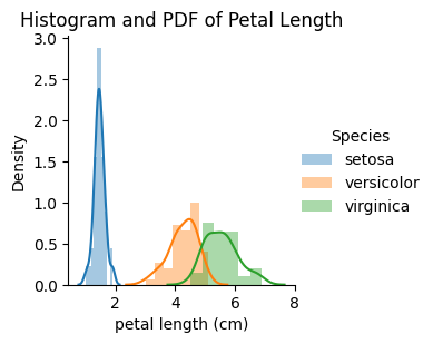
Histogram and PDF
A histogram is a graphical representation of the distribution of numerical data. The histogram represents the number of points that exist for each bin(range of values).
PDF is a Probability Density Function which is the smoothening of the histogram.
Python Code: sns.FacetGrid(iris_df, hue=”Species”) \ .map(sns.distplot, “petal length (cm)”) \ .add_legend(); |
Output:
Remarks:
- In the above graph, the lines that are drawn are PDF, and the Bars drawn a histogram. setosa is easily separable based on Petal Length.
- There is an overlap between Versicolor and Virginia
Scatter Plots
A scatter plot is a plot that shows the relationship between two variables of a data set.
| Python Code: sns.set_style(“whitegrid”); sns.FacetGrid(iris_df, hue=”Species”) \ .map(plt.scatter, “sepal length (cm)”, “sepal width (cm)”) \ .add_legend(); |
Output:

Remarks:
- Based on the blue color, Setosa are easily differentiable
- Versicolor and virginica overlap in Sepal Lenght and Sepal Width as well. They are not easily separable.
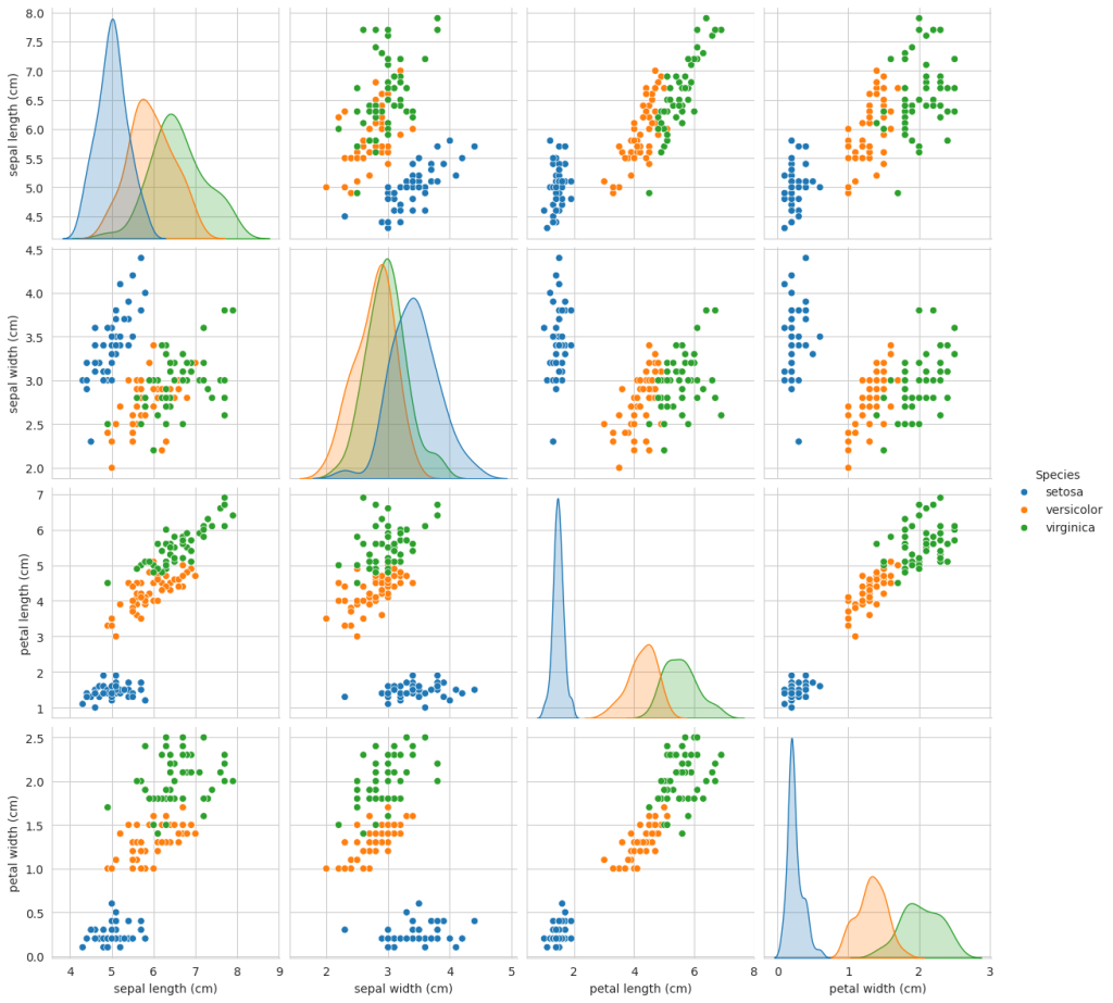
Pair Plot
A pair plot is used to see the distribution of single variables and relationships between two variables.
We can use a pair plot with numerical data only and with fewer features. It cannot be used for high-dimension data.
| Python Code: sns.set_style(“whitegrid”); |
Output:

Remarks:
- Petal Length and Petal Width come out as the most useful and important features.
- Setosa is easily identified and separable.
- The diagonal plot showcases the PDF of a single feature.
Heat Map
A heatmap is a graphical representation of data in which data values are represented as colors. It uses color to communicate the correlation between two variables. Values are between -1 to 1. 1 denotes a perfect positive correlation. 0 means no correlation and -1 means the highest negative correlation.
Let us plot a heat map for the Iris dataset.
| Python Code: sns.heatmap(iris_df[[‘petal length (cm)’,’petal width (cm)’, ‘sepal length (cm)’,’sepal width (cm)’]].corr(),annot=True) |
Output:

Remarks:
- Petal Length and Petal Width show the highest positive correlation of 0.96
- Petal Length shows a high positive correlation of 0.87 with Sepal Length as well.
- Sepal Width shows a negative correlation with the other 3 features.
We have discussed all major visualization methods here. With practice, we can visualize and explore data with these visualization methods easily.
Final Thoughts
In this article, we have discussed the basic data analysis and visualization methods. There are many more plots, graphs, and libraries available which we explore in later posts. First, practice these graphs on various in-built datasets of scikit-learn for better understanding.
Stay Tuned!!
Learn the t-distributed Stochastic Neighbor Embeddings (t-SNE) Algorithm for beautiful visualizations here.
Keep learning and keep implementing!!


Excellent presentation
Great!!